Where ideas meet people
The newly launched agency needed to create a clear and memorable presence that conveyed energy, accessibility and professionalism within its very first month of operation. The goal was a visual identity that felt young and dynamic, yet trustworthy and flexible enough to work across platforms.
The creative solution
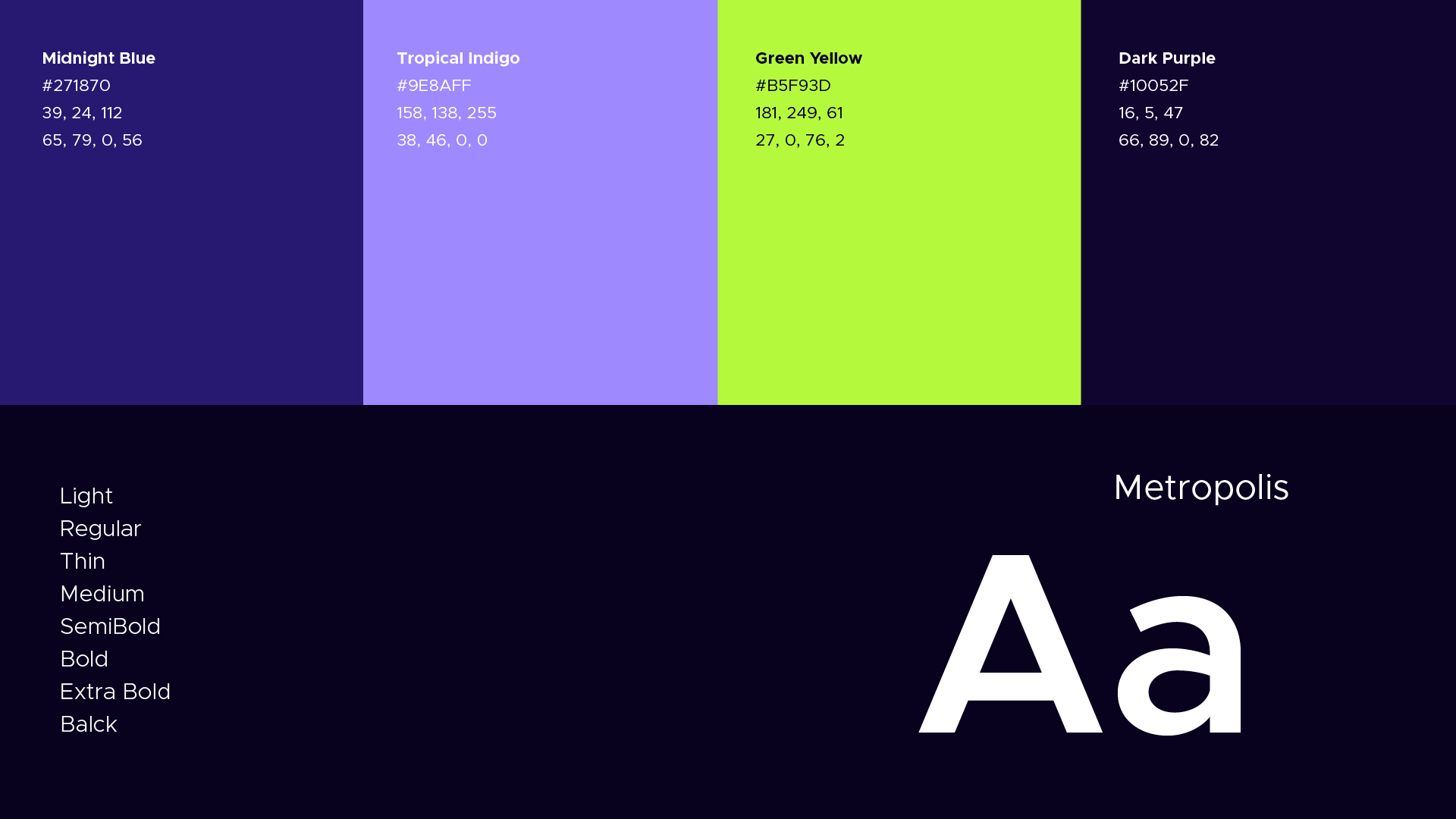
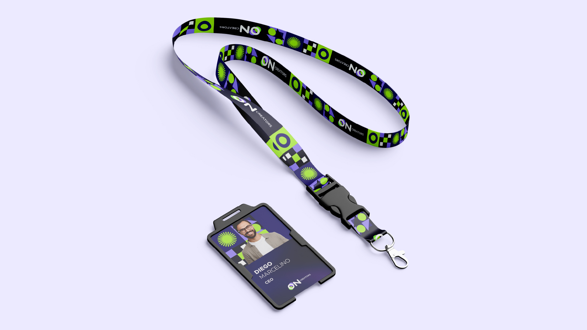
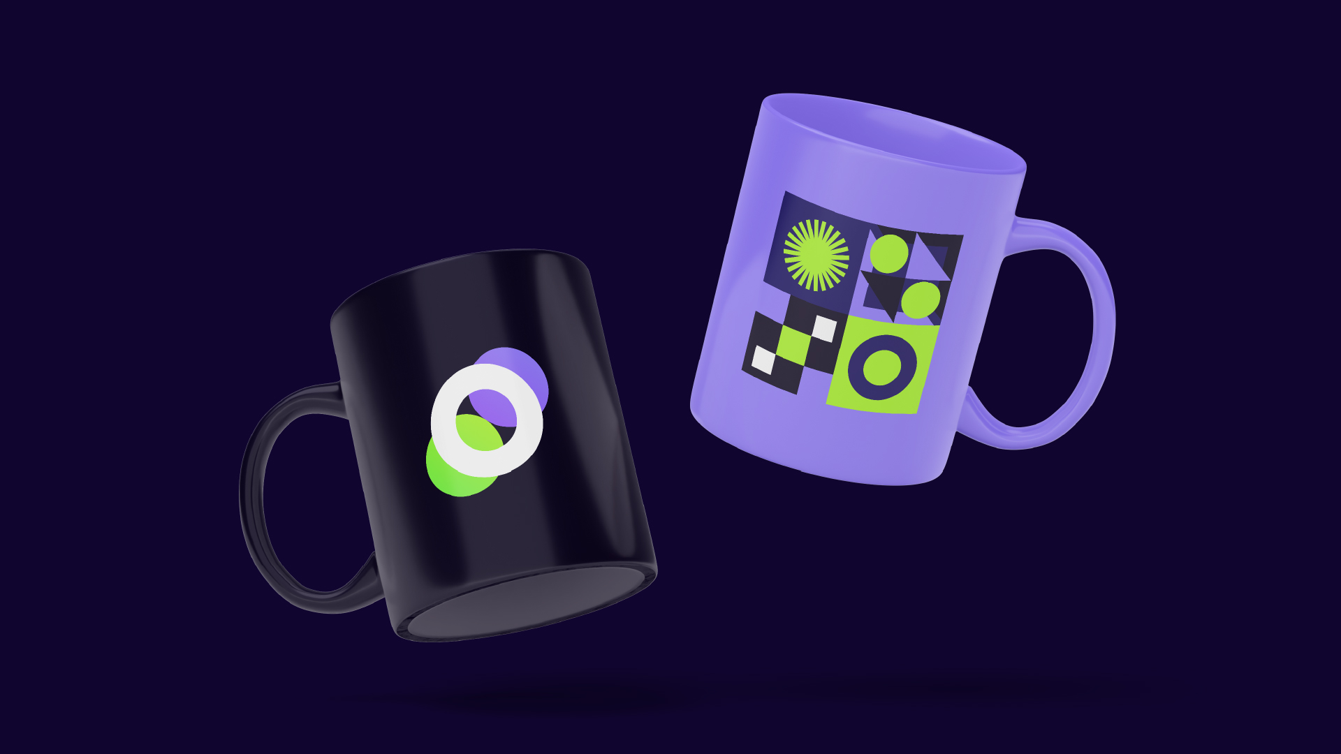
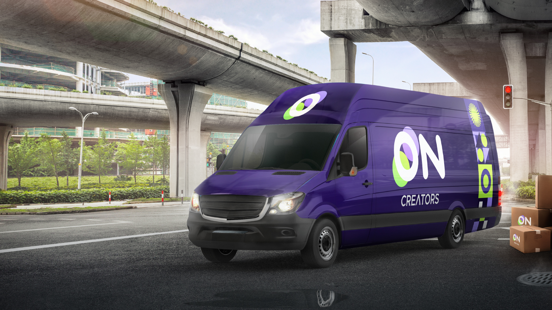
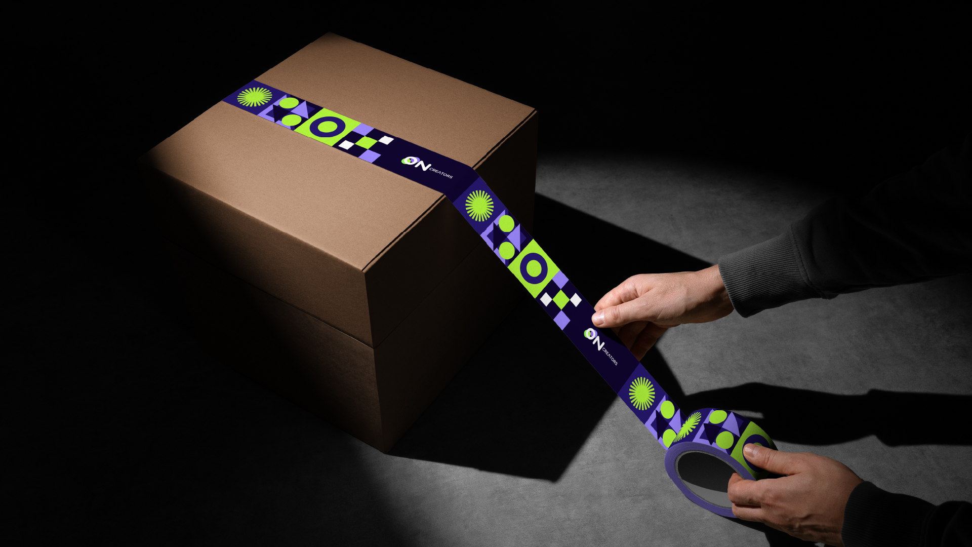
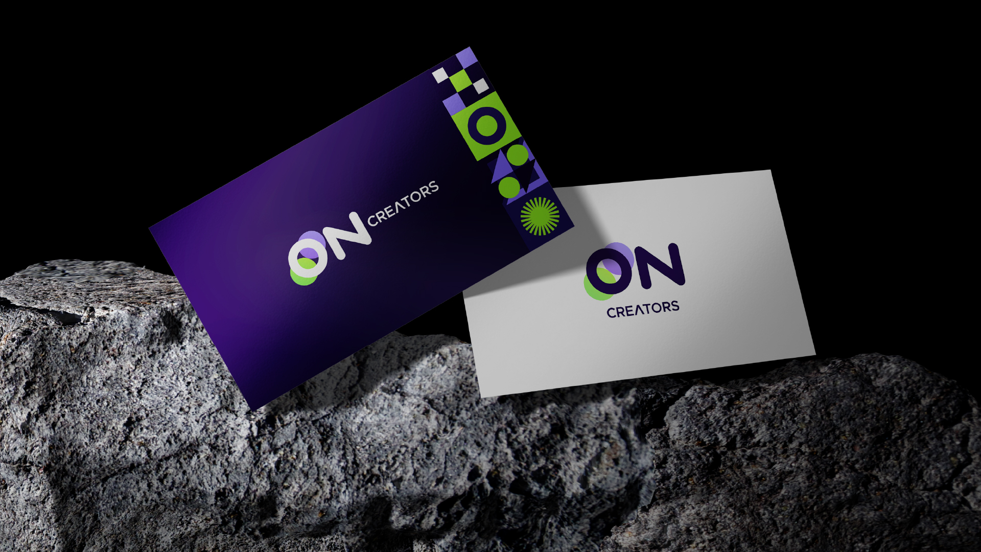
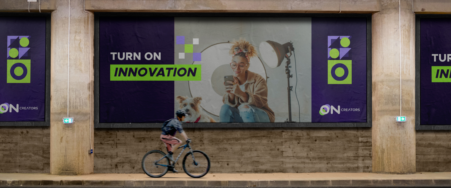
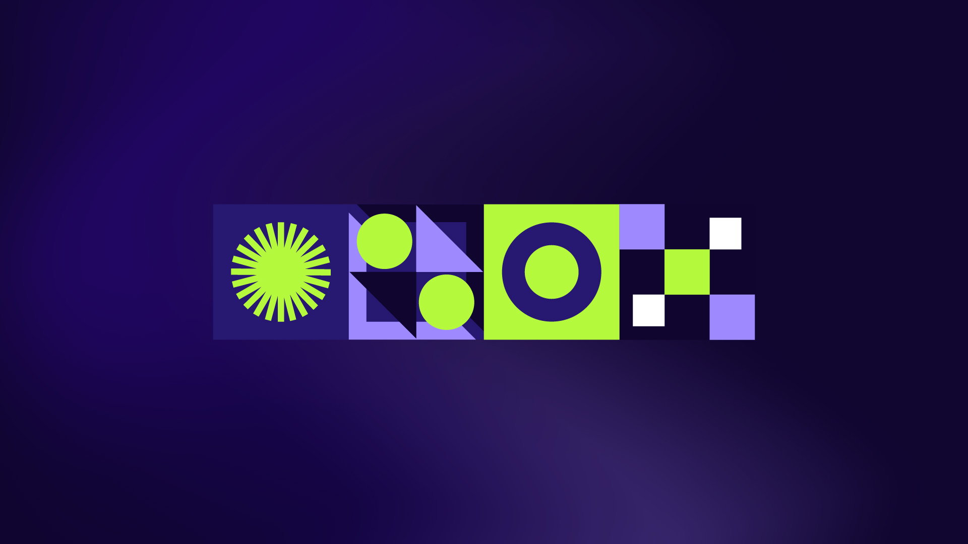
The concept was based on the company name «ON» — a symbol of activation. Key elements included a modern light-bulb symbol representing idea activation, a color palette of deep purple, citrus green and digital accents, and the Metropolis font in several weights. The system is flexible and works as logo, watermark, stamp and signature.
Results and impact
The identity reinforced the company's core message of digital humanization, accessibility and strategic creativity. It gained quick recognition in the local market and a solid foundation for further expansion into other regions.